0
Got an idea? Let's discuss!
Service
Budget
Information
I found your agency through
Bettermotion
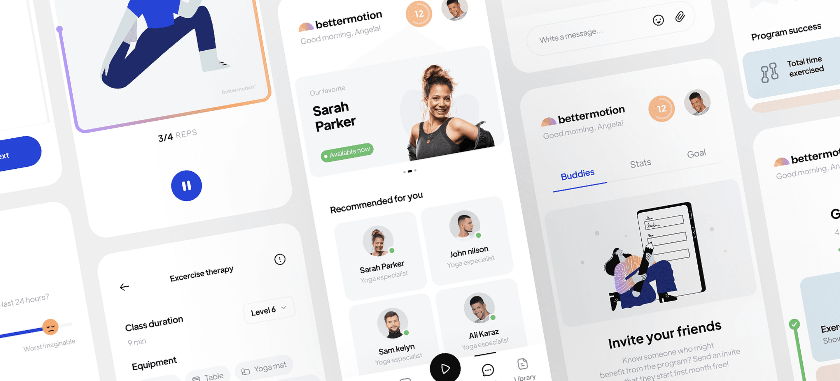
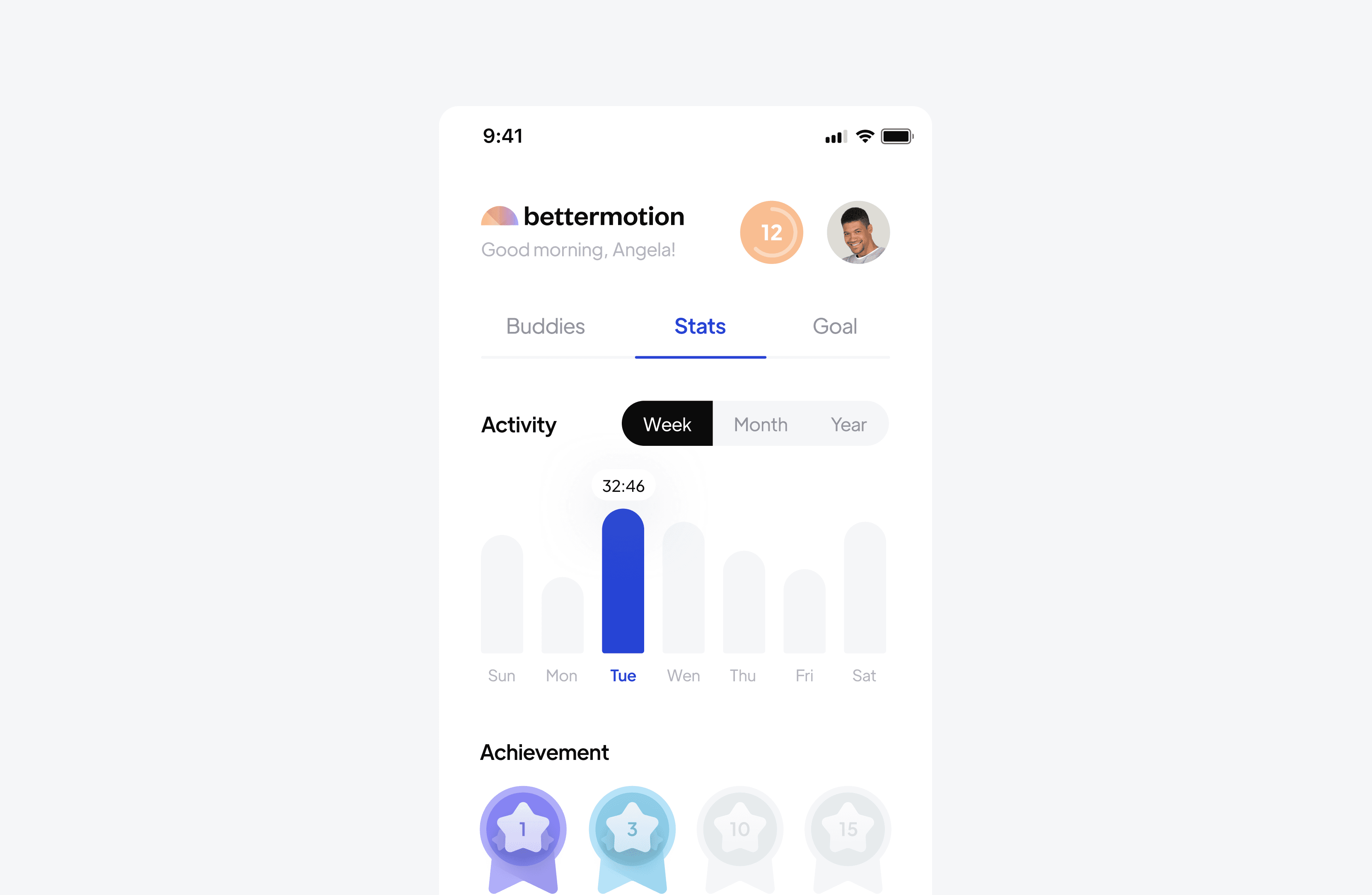
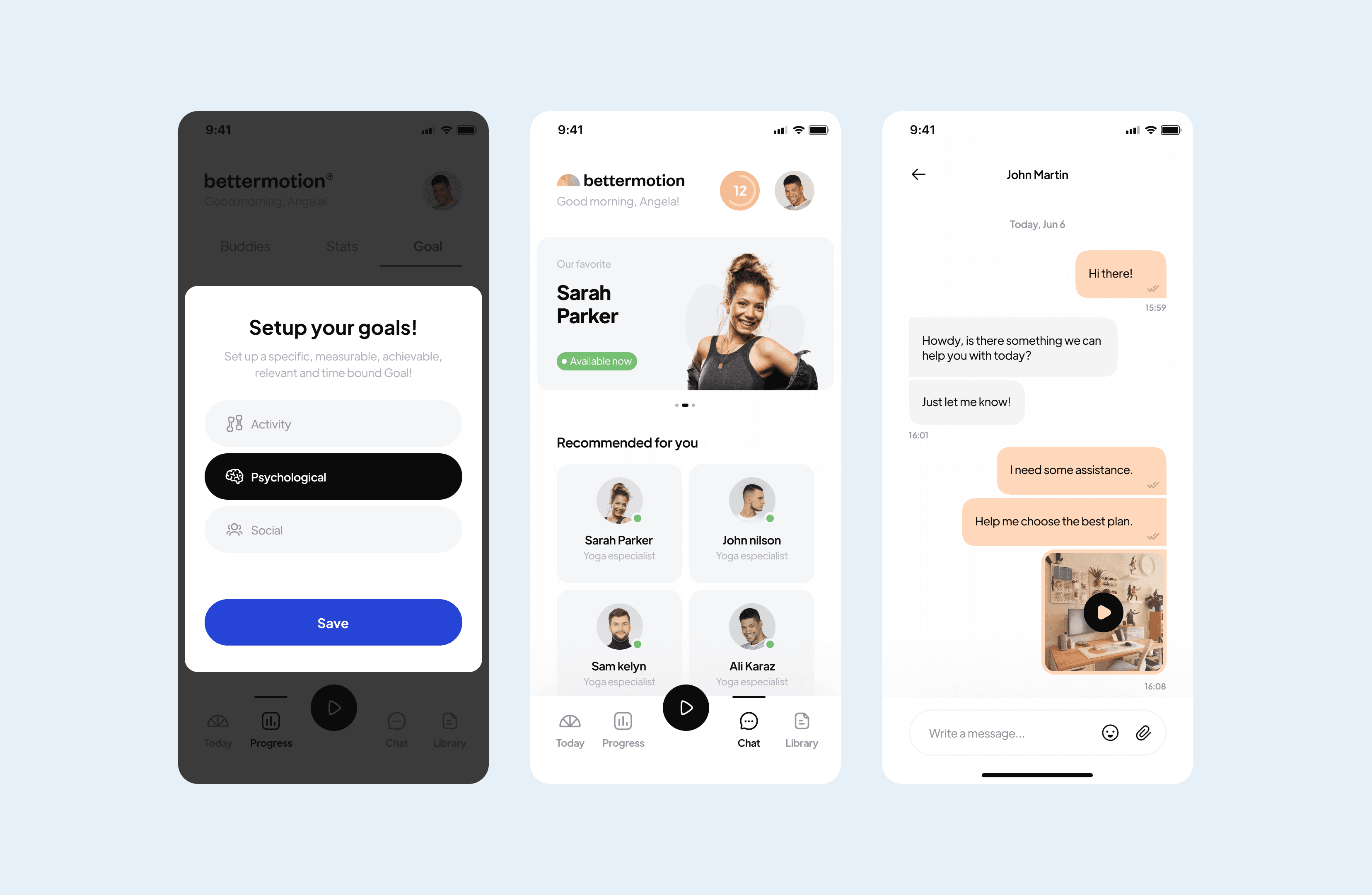
Bettermotion, specializing in the health sector, is making strides in the Chinese market. Our core mission is to uplift people’s spirits and cultivate a sense of ease in the complexities of today. With a focus on mobile app design, we’ve strived to infuse a feeling of lightness and comfort, ensuring a positive and user-friendly experience from the project’s inception.
Services
Product Design
Illustration
Development
Industry
Health
Location
China
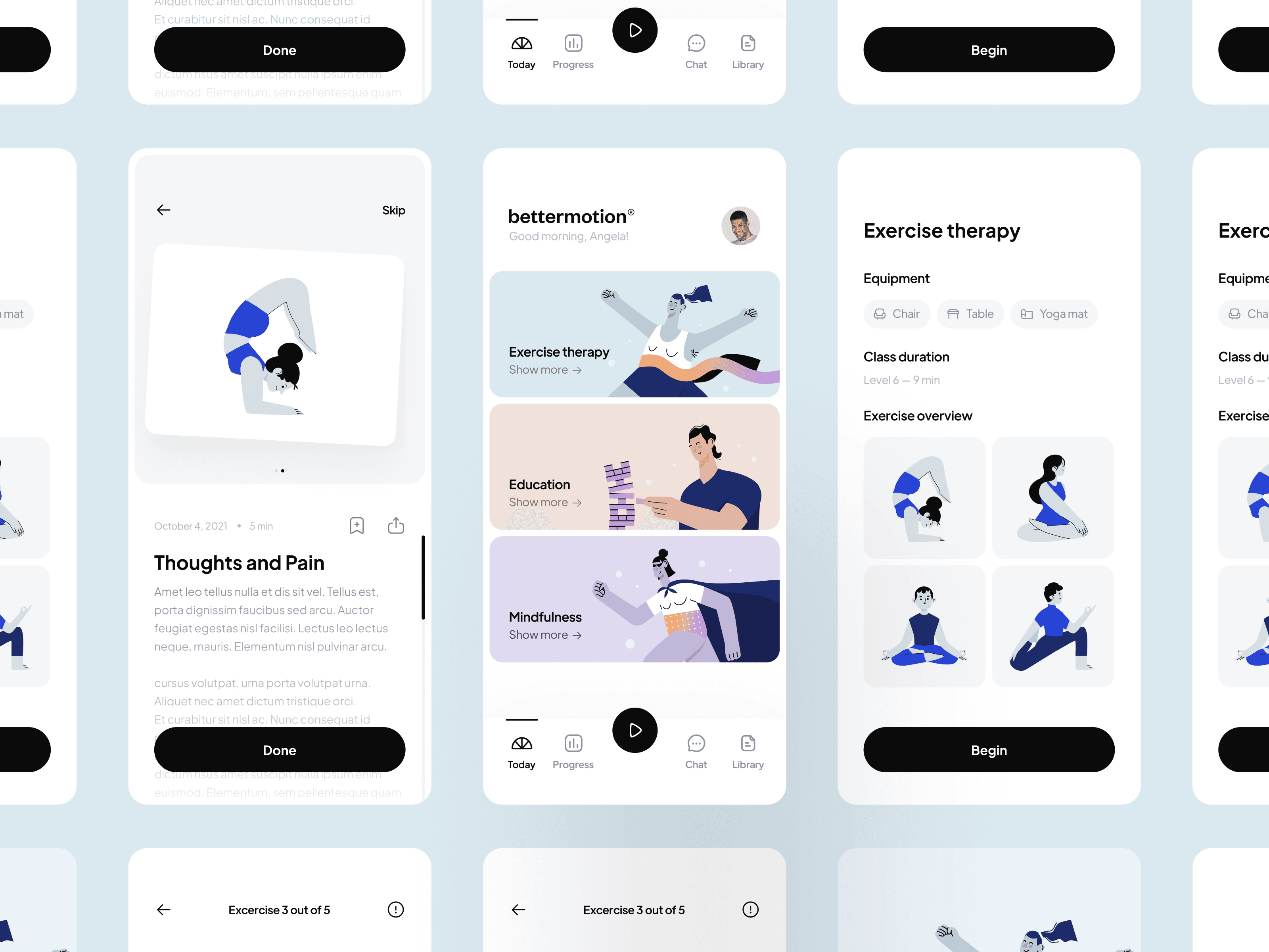
Product Design
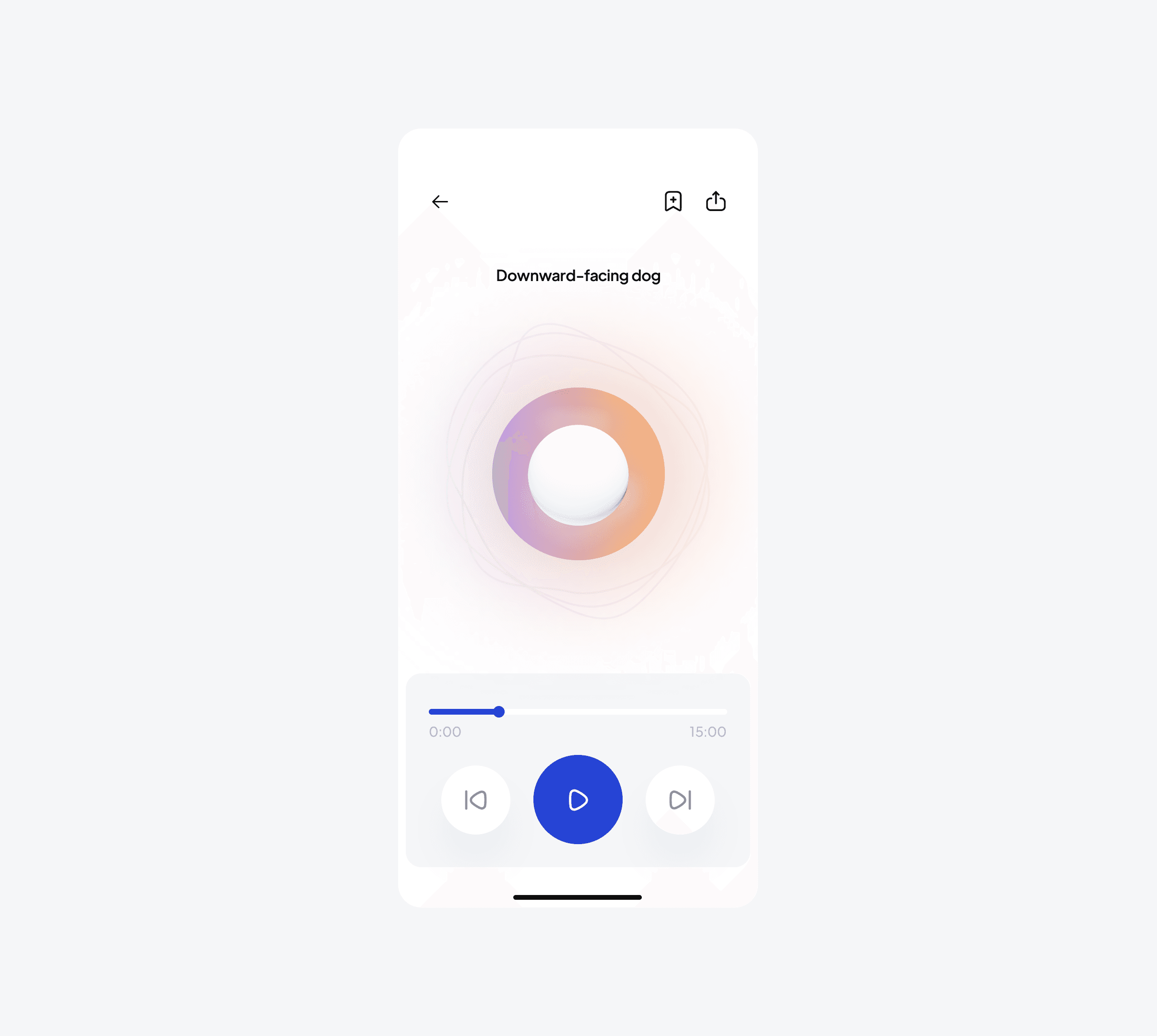
To execute this project, we started by wireframing the design, then sequentially completed the pages. Finally, we crafted visualizations based on the client’s requests.
Branding
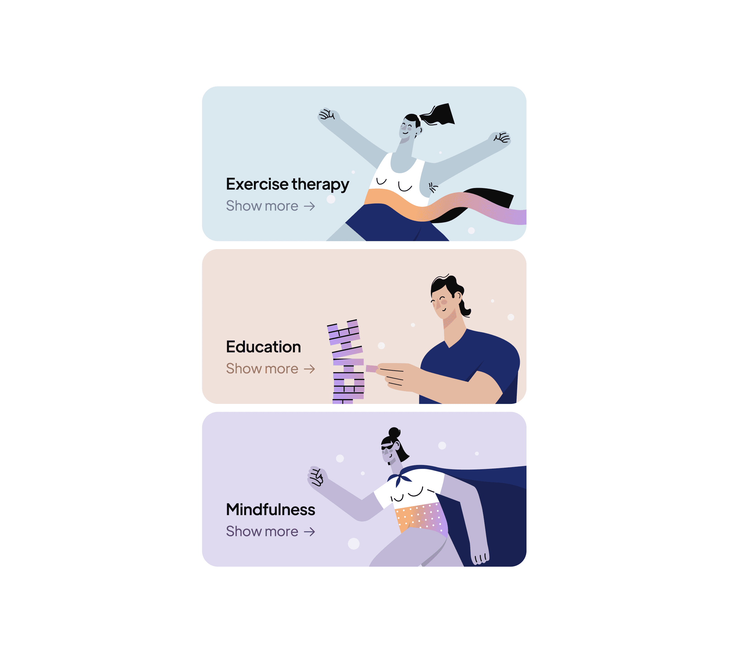
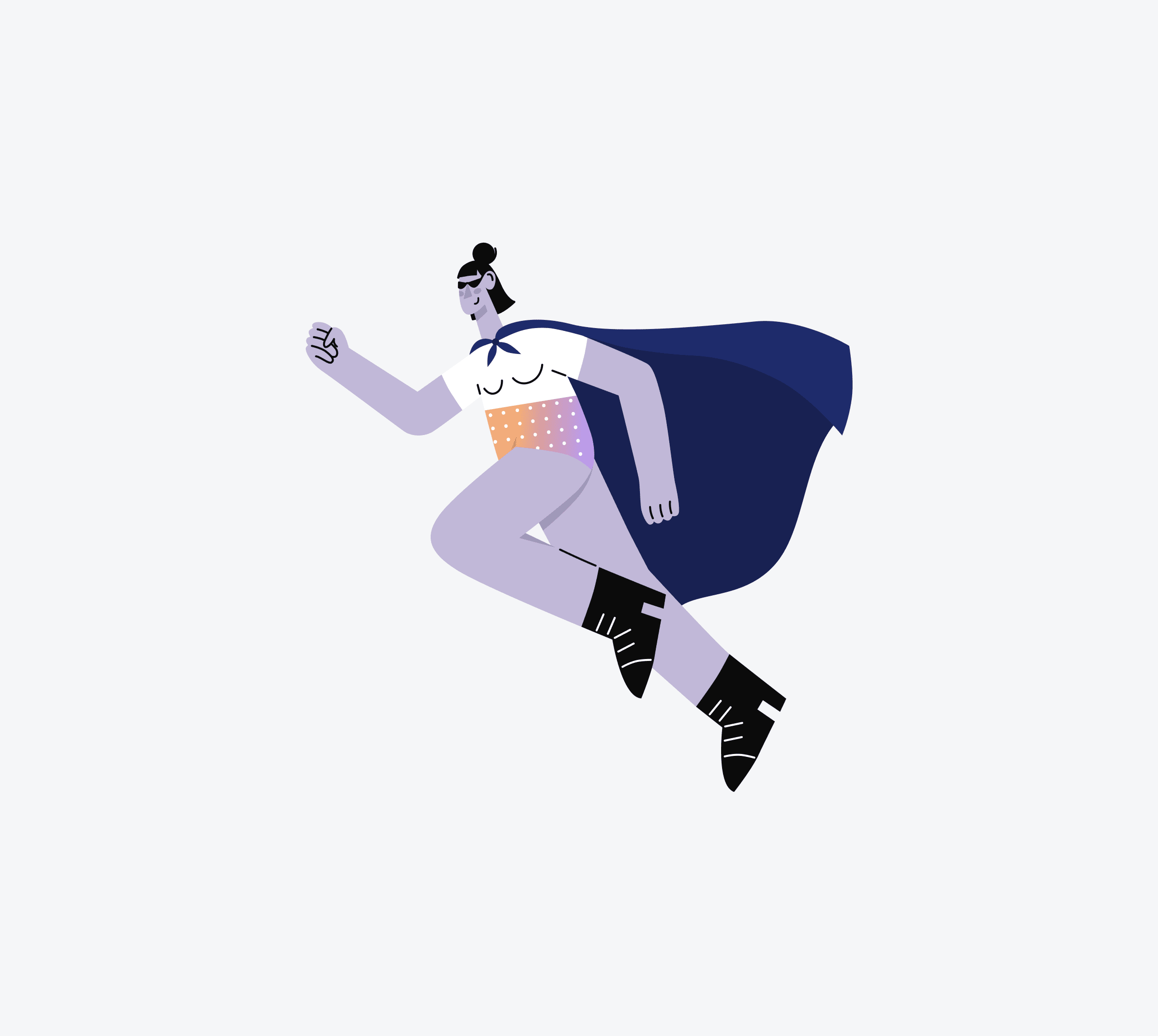
We shaped a visual identity that’s both fresh and reassuring — soft color palettes, rounded typography, and a friendly logo that evokes trust and calm. The branding strategy was designed not only to appeal to users in the Chinese health market but also to position Bettermotion as a modern and empathetic tech brand with global potential.
Design Assets
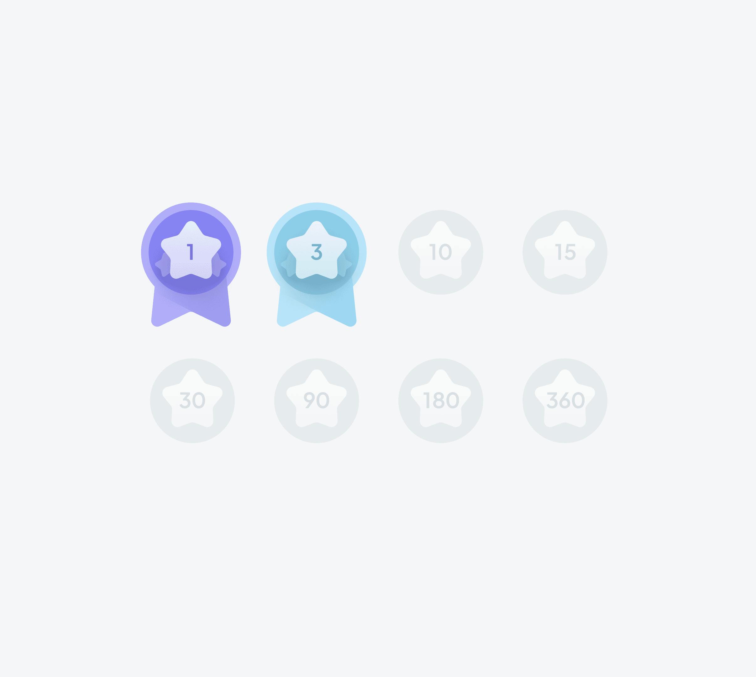
Our team developed a comprehensive library of custom design assets to ensure consistency across all touchpoints. From icons and illustrations to UI components, each asset was carefully tailored to match the brand’s tone — soft, human, and supportive. These assets became foundational building blocks, streamlining development and maintaining design quality at scale.
works
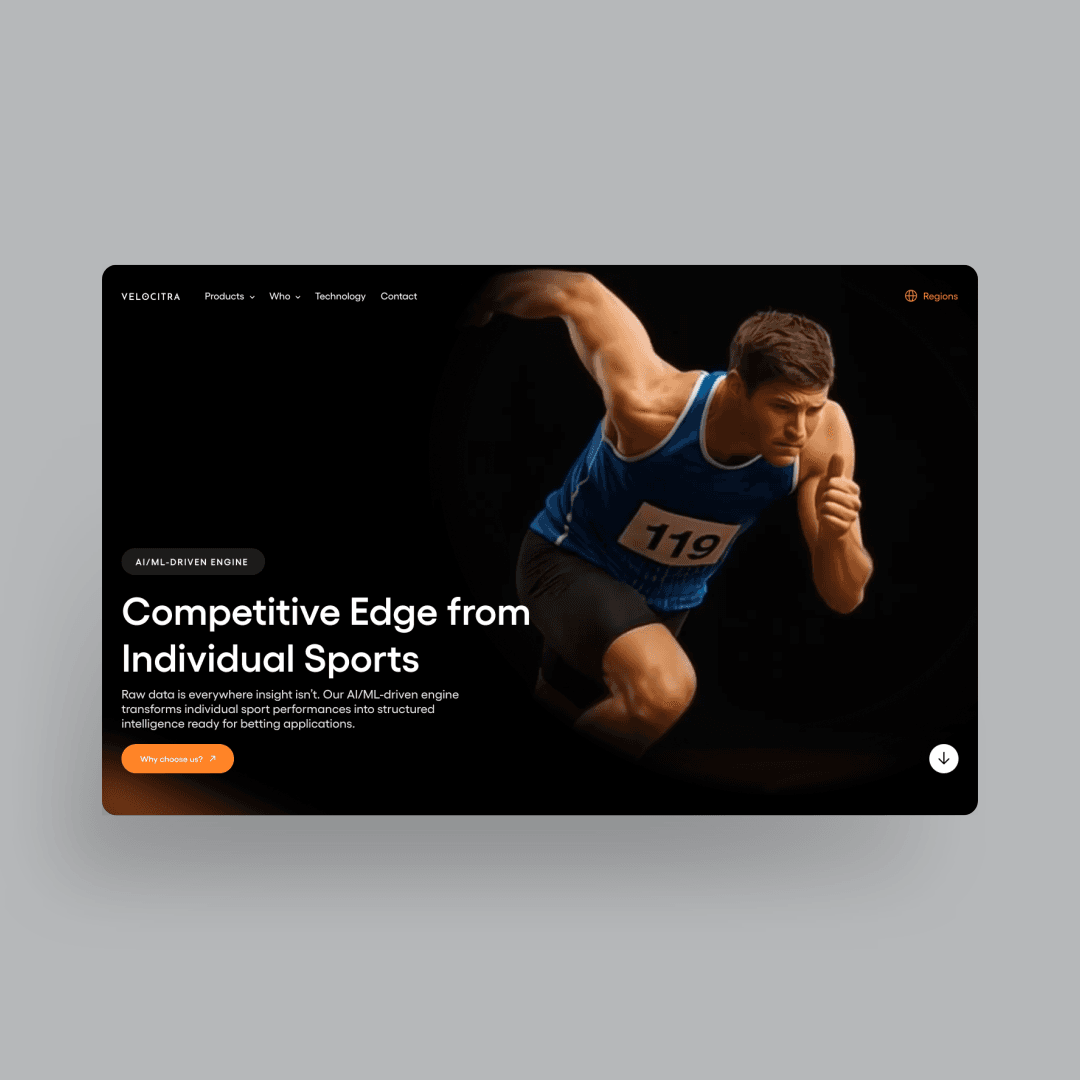
Velocitra Website
Product Design
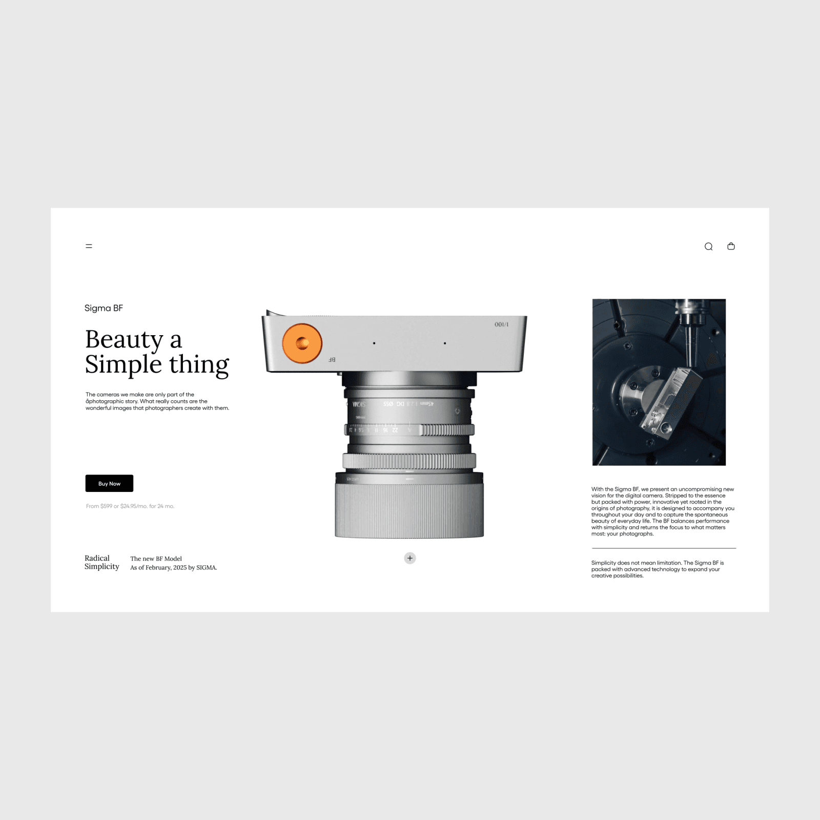
Sigma Website
3D
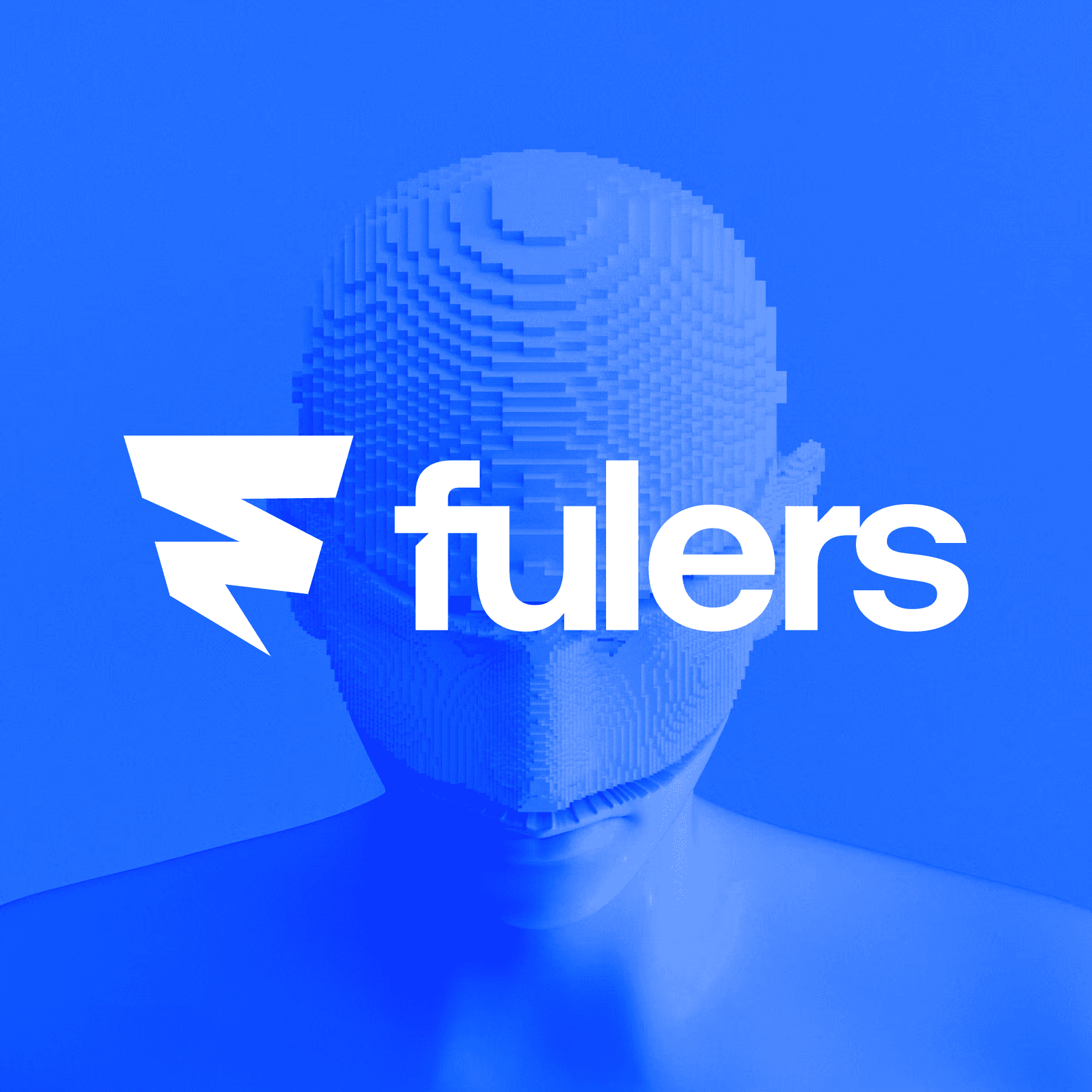
Fulers
Branding
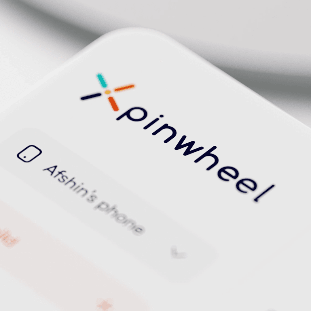
Pinwheel
Product Design
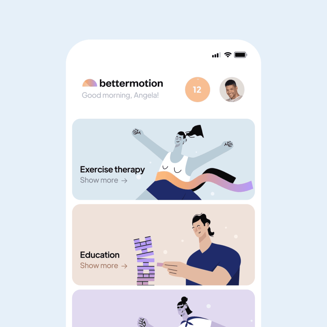
Bettermotion
Product Design
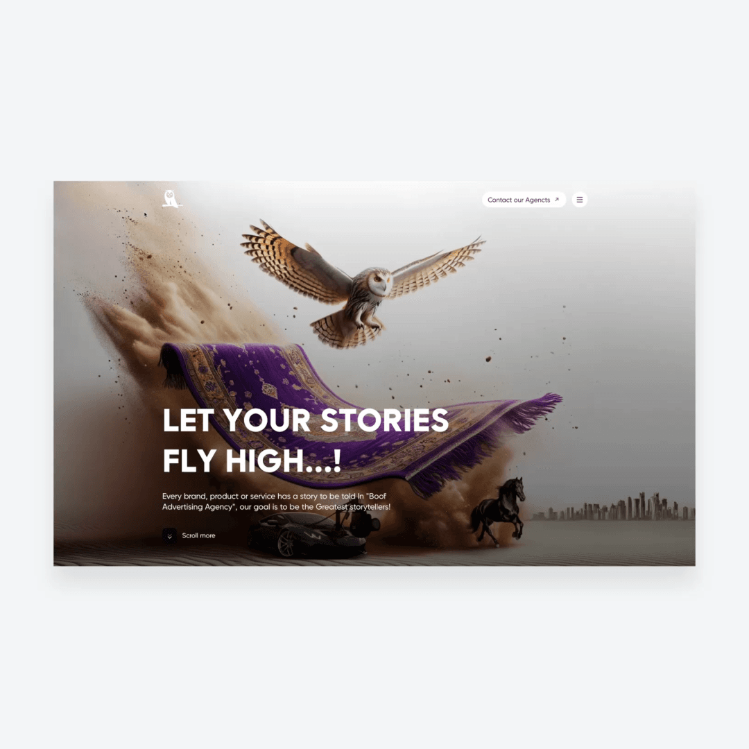
Boof
Product Design
Skale
Development
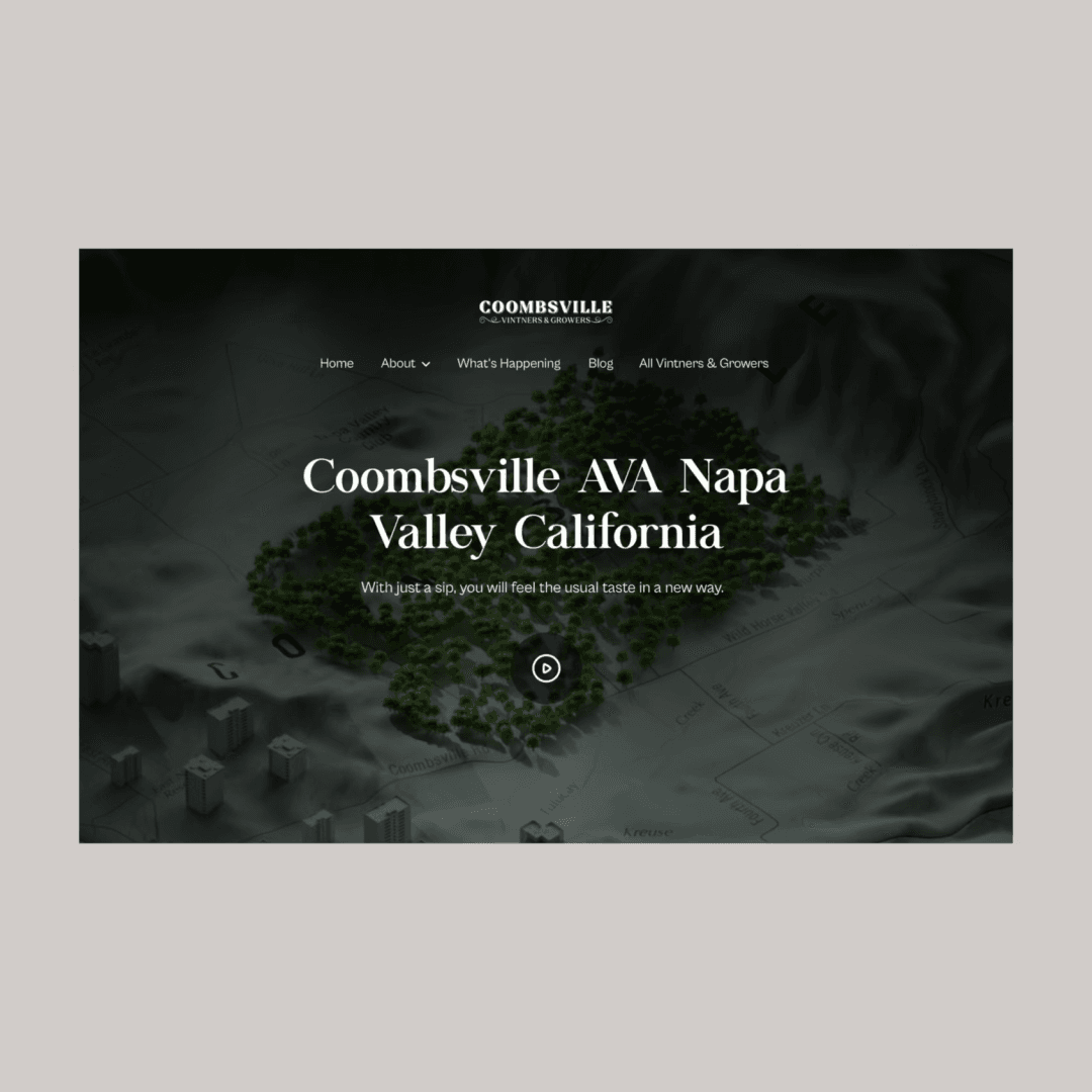
Coombsville Project
Animation
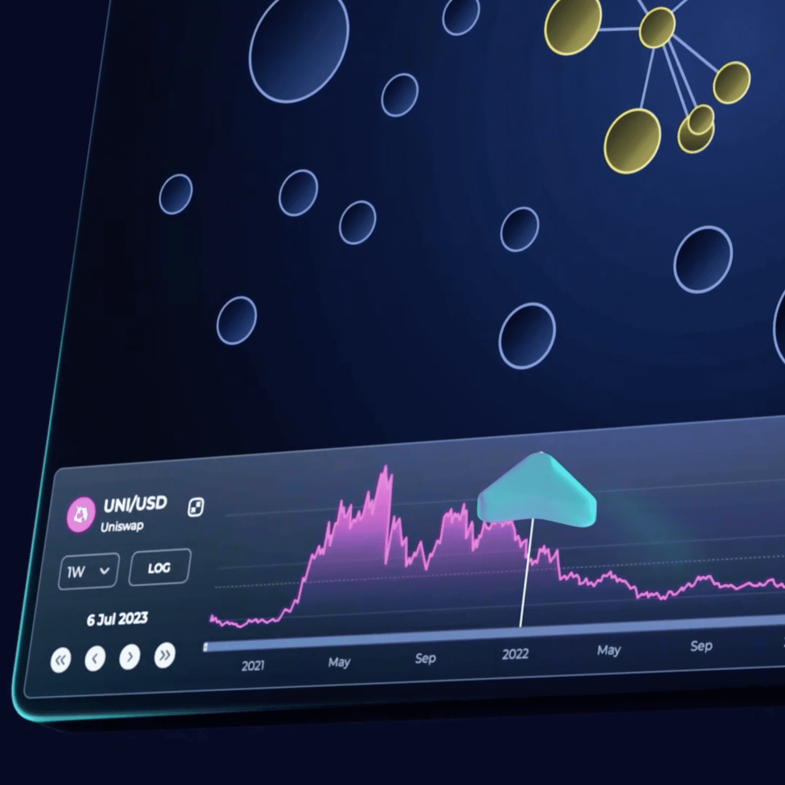
Bubblemaps Video Project
Animation
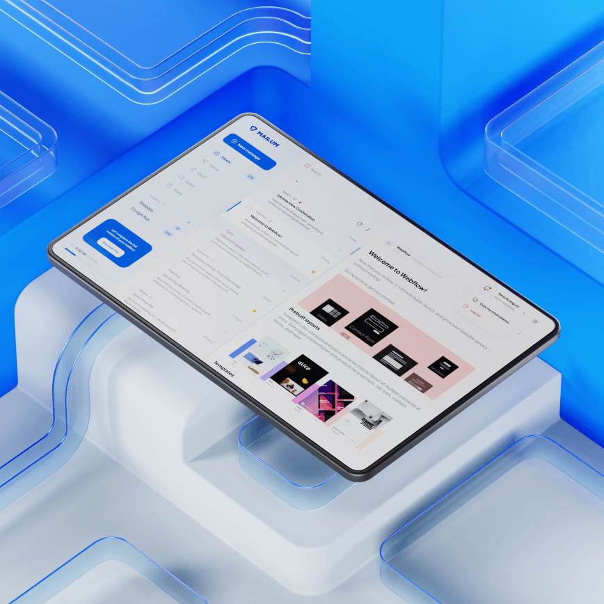
Mailum
Icon Design
Superchat Character
3D
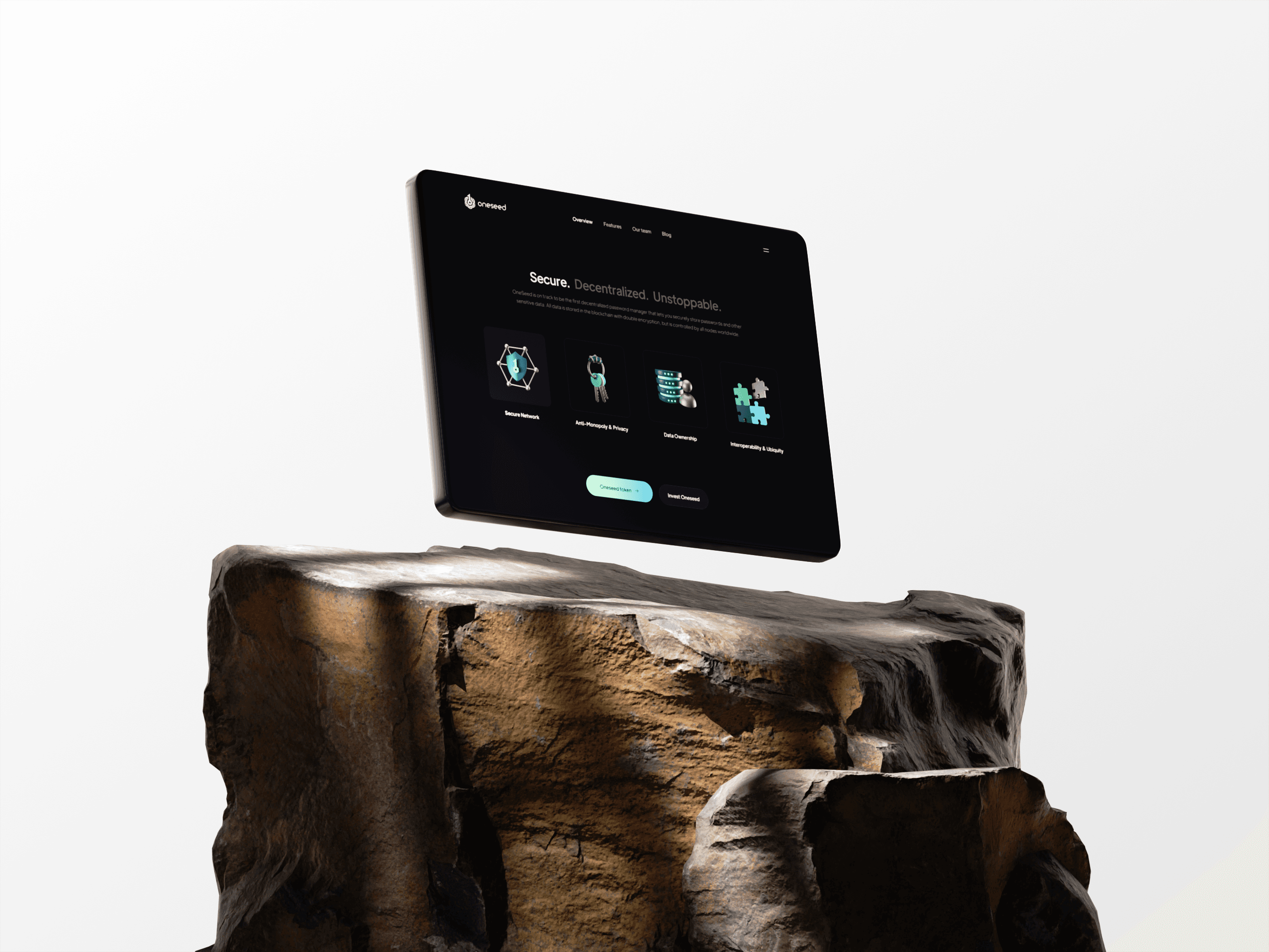
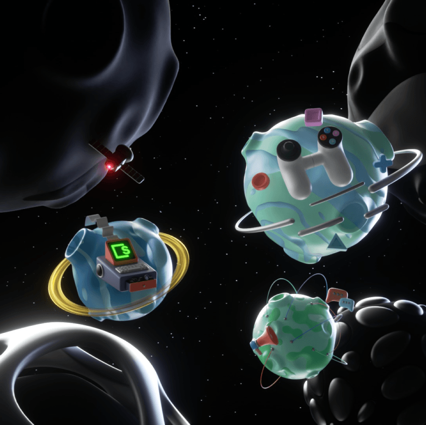
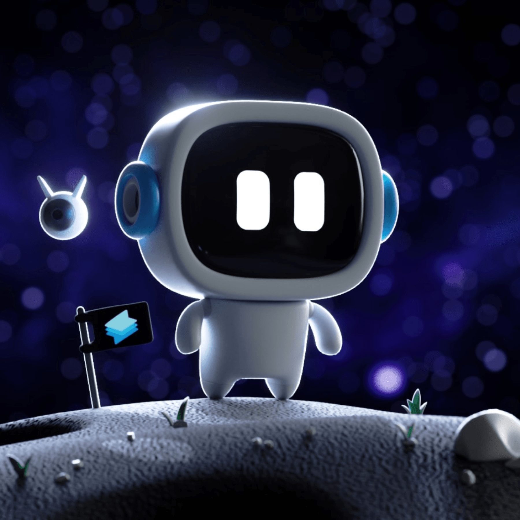
Oneseed
3D